Instagram’s popularity is something that remains a big mystery to me (and Aayush, too) considering it only allows iPhone users to upload photos. The service has taken off like a rocket and the onus of bringing it to other platforms has been put on third-party developers. Instadesk was the first app to take the leap for the Mac platform, but apps like Carousel and Instaview have also made their way onto OS X. Let’s take a look at these three Instagram apps for Mac today and see how they fare.
Instadesk– Meritorious but Humdrum
Instadesk was the first Instagram app for the Mac after they released an API for third-party developers. Taking full advantage of the API, Instadesk brings the whole Instagram experience to the Mac (except photo uploads, which the API doesn’t allow yet).
Unlike the other two apps we’re reviewing, features a conventional & typical native Mac app look and UI. It more-or-less reminds me of LittleSnapper with its placing of different sources in the Sidebar. The sidebar on the left gives you quick access to your own Feed, the Popular feed, Tags and News. The photos are laid out nicely in a grid layout against a dark background. Clicking on a photo opens it up in its glorious full-size, and information about the photo is displayed in a sidebar on the right this time. Here, you can view the Comments/Likes a photo as received, as well as leave your own comment. Icons in the toolbar up top allow you to Like, Share, Download or Open the photo in the browser. You can browse through the different photos using the arrow icons or even your keyboard.

Instadesk also has a nifty slideshow feature that runs fullscreen and gives you a bunch of transition options to choose from. My desktop setup consists of a 15″ MacBook Pro connected to a 24″ Apple Cinema Display, and Instadesk allows me to run the slideshow in my secondary display while the primary display is left for other apps. You can even ‘Like’ a photo if you want and quickly get back to where you were, without interrupting the slideshow.
Overall, while Instadesk is a great app, it feels a little unpolished to me. Having tried the other two apps in the post as well, I’d personally much prefer the custom, streamlined look of those apps than this native, full-blown look. So while Instadesk is functionally great, the UI keeps me from recommending it to anyone. It is available on the Mac App Store for $1.99.
Carousel – Instagram for Mac Swiss Knife
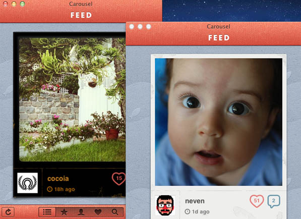
Carousel wasn’t the first Instagram client for Mac to hit the market but it surely is the best one yet. Carousel takes the traditional approach to display your Instgaram feed in a slick and elegant UI resembling a photo album. The interface is almost a no-brainer and using it is child’s play. There are five buttons along the bottom that toggle your view between the feed, favorites, your photos, likes and a search feature introduced in the first point update to the app. The search tab lets you lookup users or even tags which is bound to appease the twitterati.
Each image in the feed is presented with the person’s avatar, timestamp and the location, provided geolocation was turned on while taking the picture. Tapping the avatar/username takes you to the user’s profile but the best part is how Carousel presents a feed of images geolocated around the same area when you click the location on an image. I almost jumped up in glee when I first stumbled upon this feature. One can Like a photo by pressing the heart or comment on it by tapping the word bubble. Both these actions bring up a iPad-like popover that shows people who’ve liked the photo or commented on it, but you can skip the popovers by using the option-click modifier.

Carousel supports multi-touch gestures and also features a number of keyboard shortcuts that further simplify the app’s usability. Photos can be viewed in Preview by hitting the spacebar. This also means you can use Preview’s full screen feature to make the photo occupy all of your screen’s real estate. Other than this, you can save the photos to your Mac by using the good old Command-S keyboard shortcut. Notifications are available in the form of an icon badge and Growl is also supported. One can set the auto-refresh interval in the settings but there’s a refresh button in the app that lets you manually do the job. The app ships with a bunch of themes to give a refreshing new look to your feed.
The latest update brought with it the ability to pin tags, locations and people to the search tab making it easier to keep track of things you like. Carousel does a brilliant job at bringing the perfect Instagram experience to the Mac which justifies the $4.99 price tag it comes attached with. It is only limited by the Instagram API which currently does not allow users to upload images from third-party applications.
Instaview – Peppy and Fun
Instaview is the latest kid on the block in the Instagram for Mac arena. It takes a whole new approach towards displaying the Instagram feed on your Mac. Instaview, rather than presenting photos from people you follow in a single feed, lets create multiple windows showing different Instagram streams. So what is an Instagram stream, you may ask? A stream can be constituted by any one of the following–a user’s photos, photos you’ve liked, popular photos, located based photos or photos with a hashtag.
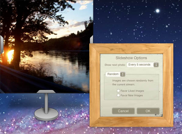
The stream is encapsulated within a photo frame to give it an old-fashioned look. There are a bunch of frames to choose from but I personally love the ‘Metal Stand’ and the ‘Wide Wood’ ones. Photo information such as likes, comments, timestamp etc. is hidden in an overlay which is shown with a mouse hover. This saves space without compromising on functionality and I definitely prefer it over Carousel’s implementation. Instaview comes with multi-touch support and a customizable interface which certainly can be improved upon. Just like Carousel, you can view and save full size images in Instaview. As far as notifications are concerned, badge on the icon and little paper in the corner of a stream are the two ways of getting notified of unveiled photos.

Slideshow is the big weapon in Instaview’s armory. The individual streams suddenly start making a lot more sense with slideshow. As the name suggests, you can cycle through images in a particular stream by putting it on slideshow. The duration and sequence of the images can be tweaked in the slideshow options. If you come to think of your Mac as a living room, then these slideshows would be the digital photo frames decorating it.
RougeSheep likes to believe that users would enjoy multiple streams–and slideshows, of course–more than a single integrated feed but I’m not totally sold on the idea. It is certainly fun at times, but the clutter it creates on the desktop isn’t very pleasing to the eye. It is definitely not something you’d like to have when you’re trying to be productive. Although Instaview does let you view your Instagram feed in a single stream, if you wish to view favorites, popular photos or other such stuff, then creating multiple streams is your only option. On the whole, Instaview takes an aggressive approach towards Instagram and the initial reviews in the Mac App Store have been encouraging. You can grab the app for $4.99 from there.
The native-full blown look of Instadesk seems a bit too overwhelming for a simple app providing access to a photo-sharing service. Instaview is the more fun and peppy way of going through your Instagram feed and I’m sure it’ll find its own niche of users.
I however prefer the simple yet beautiful Carousel interface that houses all Instagram features under a single roof without creating clutter on my desktop. Instadesk is the cheapest way to go about things but both Instaview and Carousel retail for the same price, so take your pick wisely.