Monthly Archives: February 2017

Sparrow, the Ideal Mail Client for Mac

Sometimes, trying out beta version of an app can lead to a sore experience that ultimately changes your perception of the app even before developers roll out the final build for public consumption. Something similar happened to me when I installed the first beta of Sparrow Mail around nine months ago. Sparrow, back then, was a Gmail-only client that had taken a leaf out of Tweetie’s book. I abandoned the app after a few betas as the design seemed too minimal & lacking important functionality, marking it as another wannabe mail client for the Mac. I wish I had stayed on to experience the revolution that Sparrow Mail has undergone since its beta days to emerge as one of the best mail clients that we have on the Mac App Store today.

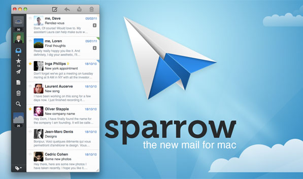
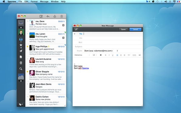
Sparrow has come a long way since its beta days and now supports all IMAP accounts including Gmail, MobileMe, Yahoo and custom IMAP. Sparrow features a three-column layout with accounts occupying the narrow left column, your list of emails in the middle column and mail content filling up the last one. Sparrow retains the minimal ‘Tweetie look’ by having a collapsible third column. The minimal look generated a lot of buzz during the beta days and is still a strong selling point of the app. Moreover, it switches between multiple accounts the same way, but that’s pretty much all the inspiration it takes from Tweetie.

If you’re a Gmail addict you’d know there is hardly a native app for Mac that provides the same level of functionality as the web app. I’m not counting Mailplane in here as it is essentially a wrapper around the web view itself. Sparrow set out to put things in order and with the latest update it has moved closer to replacing Mailplane as the default mail client on my Mac. The first point update added support for Gmail labels, priority inbox and keyboard shortcuts. Gmail labels and folders can be edited straight from within Sparrow, helping you keep your inbox neat and tidy. The only small glitch that I encountered while using the app is that Gmail label colors aren’t synched over and if you’re used to color coded messages, then it would take some time to set things right by editing the label colors manually. Sparrow v1.2 came with a slew of new features that included unified inbox, threading by subject and Facebook integration, bolstering its strong feature set.

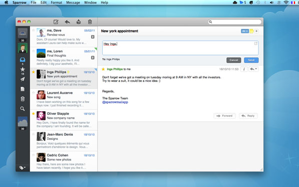
Unified inbox was Sparrow’s much awaited feature and now with its inception you can browse emails from multiple inboxes under a single roof. Sparrow claims to be the world’s first social email client by adding Facebook integration. Simply punch in your Facebook account details to populate the mailbox with profile pictures of your Facebook friends to make identification easier and make your inbox look prettier. Although the Facebook integration is nice and innovative, I absolutely love the way conversations feature has been implemented. It neatly bundles the message history while showing only the latest message in the conversation. The bundle is sorted chronologically displaying the timestamp corresponding to each message. Also there is this really cool quick reply feature making replying to emails super quick. A click on the quick reply button and magically pops out a reply box atop the message without cluttering your workspace with another window. One can however bring up the compose window to reply to emails that comes loaded with a formatting bar allowing you to change fonts, font size, add lists, indent, align etc. Similar to Mail.app, Sparrow has inline attachments and Quicklook feature that lets you preview attachments without having to download them. Search bar is integrated into the app and can sort queries by sender, recipient, subject or mail content. The top bar has handy shortcuts to compose, reply, archive or thrash mail but once you get used to the keyboard shortcuts, you will not give a damn about the top bar shortcuts. There are plethora of keyboard shortcuts and memorizing them greatly enhances the overall app experience.

Sparrow uses your chat avatar and associates it with your account, though you can assign a different one to each account. Signatures however, have to be set up manually for each account. MobileMe users will take comfort in the fact that Sparrow supports aliases and they are brought over automatically during account set up. While setting up a mail account, Sparrow can download the entire mailbox but if you have a really large inbox, you can check the option to download messages on demand, which limits the synchronization. Notifications are an essential part of any mail client and Sparrow acknowledges that and ships with Growl integration out of the box. Apart from Growl notifications, new mail alerts ring in with a chime and the unread mail count is displayed on the dock icon and the menu bar, all of these settings can be toggled in the preferences pane to suit your taste. Overall, Sparrow pays attention to detail and is highly intuitive with an impressive feature set, making it one of the best mail clients for the Mac platform.

Sparrow has an aesthetically pleasing interface and it goes about its job nonchalantly. The developers have added some cool animations that not only serve as eye candy but also add to the functionality of the app. I’ve used the enhanced Mail.app that Apple intends to ship with Lion and Sparrow is already a step ahead of it. Honestly speaking, Sparrow is close to being the perfect mail client for the Mac platform, for me atleast. With Loren Brichter, developer of Tweetie and Dave Morin, CEO of Path joining Sparrow’s advisory team, one can only expect Sparrow to touch new level of awesomeness.  Sparrow retails for $9.99 on the Mac App Store and is worth every cent.

Manage Your Calendar the Fantastical Way

iCal is the the first app that gets fired from my dock everyday in the morning. It is my preferred event manager that helps me organize my work schedule, keep track of household chores and even set birthday reminders. It helps me get through the day with ease, making it indispensable and any app that improves upon the whole iCal experience is more than welcome. Enter Fantastical. The beautiful Fantastical app ships from the Flexibits factory. It does an amazing job at simplifying the whole iCal experience. Also not only does Fantastical work on iCal, it also supports Outlook and BusyCal.

iCal, Outlook or BusyCal are all complete applications in themselves and Fantastical does not add any new features to them. But before you give up on Fantastical, read on to find out how it changes the whole iCal experience. I’ll continue to use iCal throughout the review but remember, all the things apply to Outlook and BusyCal users as well.

Fantastical resides in the menu bar and a click on the icon reveals the shiny rectangular drop down interface that houses the calendar and allows to add and view events. When using the app for the first time, you’ll notice elements and animations that have been meticulously added by the developers at Flexibits. Be it the words flying out from the text box, pencil-made circles on the dates, brushed paint highlighting the event date or the calendar clinging to the two staple pins, each and every detail has been done brilliantly. The neat and compact interface lays the groundwork for an easy switch from iCal to Fantastical.

Fantastical picks up events already added to iCal and any new events created in Fantastical are added to iCal automatically. Adding new events is easy like a pie. Start typing in the text box to create an event or create one by double tapping a particular date. The app has plain English support, so I can type “Call Preshit tomorrow at noon” and a new event gets created with the specified date and time. Dates are also recognized in plain english, paving the way for super fast event creation. When you begin to type, the calendar slides down, revealing options to add event location, duration, select a calendar or even add invitees to the event. Simply put, the app looks great and works great but the inability to edit/delete an event or create a To-Do is sorely missed in the app.

Fantastical comes with quite a few preferences to tweak around. Apart from the menu, the app can be accessed by a custom keyboard shortcut. The menu bar icon can be customized to show only the date or date along with weekday or month. Default calendar and alarm settings for timed events and all-day events can be set within the preferences. So if you usually like to be alerted, say, 15 minutes before an event, let Fantastical in on this fact and it will appear as your default alarm setting for new events. I like the option to manually set the number of days to view the event list for. This means you can have Fantastical show the events just for today or for the next 31 days. Events from your super secret individual calendars can be hidden in the preferences too.

If you’ve reached this far reading the review, pull out your credit card because I’m sure you’ll wanna buy Fantastical. By concocting just the right ingredients, Flexibits developers have come up with the perfect recipe to manage your calendar. The ubiquitous nature of the app coupled with beautiful and super easy to use interface, makes it worth the $19.99 it retails for on the Mac App Store. There is also a 15-day trial version available if you still can’t make up your mind. iCal power user like me would surely want to splurge on this handy little app that makes your life just a little bit easier to manage.

Instagram Apps for Mac Put Under the Scanner

Instagram’s popularity is something that remains a big mystery to me (and Aayush, too) considering it only allows iPhone users to upload photos. The service has taken off like a rocket and the onus of bringing it to other platforms has been put on third-party developers. Instadesk was the first app to take the leap for the Mac platform, but apps like Carousel and Instaview have also made their way onto OS X. Let’s take a look at these three Instagram apps for Mac today and see how they fare.

Instadesk– Meritorious but Humdrum

Instadesk was the first Instagram app for the Mac after they released an API for third-party developers. Taking full advantage of the API, Instadesk brings the whole Instagram experience to the Mac (except photo uploads, which the API doesn’t allow yet).

Unlike the other two apps we’re reviewing, features a conventional & typical native Mac app look and UI. It more-or-less reminds me of LittleSnapper with its placing of different sources in the Sidebar. The sidebar on the left gives you quick access to your own Feed, the Popular feed, Tags and News. The photos are laid out nicely in a grid layout against a dark background. Clicking on a photo opens it up in its glorious full-size, and information about the photo is displayed in a sidebar on the right this time. Here, you can view the Comments/Likes a photo as received, as well as leave your own comment. Icons in the toolbar up top allow you to Like, Share, Download or Open the photo in the browser. You can browse through the different photos using the arrow icons or even your keyboard.

Instadesk also has a nifty slideshow feature that runs fullscreen and gives you a bunch of transition options to choose from. My desktop setup consists of a 15″ MacBook Pro connected to a 24″ Apple Cinema Display, and Instadesk allows me to run the slideshow in my secondary display while the primary display is left for other apps. You can even ‘Like’ a photo if you want and quickly get back to where you were, without interrupting the slideshow.

Overall, while Instadesk is a great app, it feels a little unpolished to me. Having tried the other two apps in the post as well, I’d personally much prefer the custom, streamlined look of those apps than this native, full-blown look. So while Instadesk is functionally great, the UI keeps me from recommending it to anyone. It is available on the Mac App Store for $1.99.

Carousel – Instagram for Mac Swiss Knife

Carousel wasn’t the first Instagram client for Mac to hit the market but it surely is the best one yet. Carousel takes the traditional approach to display your Instgaram feed in a slick and elegant UI resembling a photo album. The interface is almost a no-brainer and using it is child’s play. There are five buttons along the bottom that toggle your view between the feed, favorites, your photos, likes and a search feature introduced in the first point update to the app. The search tab lets you lookup users or even tags which is bound to appease the twitterati.

Each image in the feed is presented with the person’s avatar, timestamp and the location, provided  geolocation was turned on while taking the picture. Tapping the avatar/username takes you to the user’s profile but the best part is how Carousel presents a feed of images geolocated around the same area when you click the location on an image. I almost jumped up in glee when I first stumbled upon this feature. One can Like a photo by pressing the heart or comment on it by tapping the word bubble. Both these actions bring up a iPad-like popover that shows people who’ve liked the photo or commented on it, but you can skip the popovers by using the option-click modifier.

Carousel supports multi-touch gestures and also features a number of keyboard shortcuts that further simplify the app’s usability. Photos can be viewed in Preview by hitting the spacebar. This also means you can use Preview’s full screen feature to make the photo occupy all of your screen’s real estate. Other than this, you can save the photos to your Mac by using the good old Command-S keyboard shortcut. Notifications are available in the form of an icon badge and Growl is also supported. One can set the auto-refresh interval in the settings but there’s a refresh button in the app that lets you manually do the job. The app ships with a bunch of themes to give a refreshing new look to your feed.

The latest update brought with it the ability to pin tags, locations and people to the search tab making it easier to keep track of things you like. Carousel does a brilliant job at bringing the perfect Instagram experience to the Mac which justifies the $4.99 price tag it comes attached with. It is only limited by the Instagram API which currently does not allow users to upload images from third-party applications.

Instaview – Peppy and Fun

Instaview is the latest kid on the block in the Instagram for Mac arena. It takes a whole new approach towards displaying the Instagram feed on your Mac. Instaview, rather than presenting photos from people you follow in a single feed, lets create multiple windows showing different Instagram streams. So what is an Instagram stream, you may ask? A stream can be constituted by any one of the following–a user’s photos, photos you’ve liked, popular photos, located based photos or photos with a hashtag.

The stream is encapsulated within a photo frame to give it an old-fashioned look. There are a bunch of frames to choose from but I personally love the ‘Metal Stand’ and the ‘Wide Wood’ ones. Photo information such as likes, comments, timestamp etc. is hidden in an overlay which is shown with a mouse hover. This saves space without compromising on functionality and I definitely prefer it over Carousel’s implementation. Instaview comes with multi-touch support and a customizable interface which certainly can be improved upon. Just like Carousel, you can view and save full size images in Instaview. As far as notifications are concerned, badge on the icon and little paper in the corner of a stream are the two ways of getting notified of unveiled photos.

Slideshow is the big weapon in Instaview’s armory. The individual streams suddenly start making a lot more sense with slideshow. As the name suggests, you can cycle through images in a particular stream by putting it on slideshow. The duration and sequence of the images can be tweaked in the slideshow options. If you come to think of your Mac as a living room, then these slideshows would be the digital photo frames decorating it.

RougeSheep likes to believe that users would enjoy multiple streams–and slideshows, of course–more than a single integrated feed but I’m not totally sold on the idea. It is certainly fun at times, but the clutter it creates on the desktop isn’t very pleasing to the eye. It is definitely not something you’d like to have when you’re trying to be productive. Although Instaview does let you view your Instagram feed in a single stream, if you wish to view favorites, popular photos or other such stuff, then creating multiple streams is your only option. On the whole, Instaview takes an aggressive approach towards Instagram and the initial reviews in the Mac App Store have been encouraging. You can grab the app for $4.99 from there.

The native-full blown look of Instadesk seems a bit too overwhelming for a simple app providing access to a photo-sharing service. Instaview is the more fun and peppy way of going through your Instagram feed and I’m sure it’ll find its own niche of users.
I however prefer the simple yet beautiful Carousel interface that houses all Instagram features under a single roof without creating clutter on my desktop. Instadesk is the cheapest way to go about things but both Instaview and Carousel retail for the same price, so take your pick wisely.

A Crash Course in Using the Mac Terminal

Almost everything can be done with the Terminal. At least that’s what the experts tell you. We find glorious “Terminal Hacks” which unlock some special features of the Mac. While for most part it’s fine not knowing, it wouldn’t hurt to know what exactly is going on behind those lines. Here’s a short crash course in using the Terminal, from a total newbie at that. Though I did do my homework, my less than exceptional knowledge of the Terminal might produce some errors in this guide. I have tried all the commands myself, so I don’t suppose anything should happen to your system, but do always backup before messing around with your system. Always.

Where’s the Terminal?

Use Spotlight to launch it, or you’ll find it in the Applications/Utilities folder.

Navigating the Terminal

The Terminal will generally launch with your home directory selected. To navigate down a folder, enter “cd foldername”. To navigate up to the containing folder, enter “cd ..”.

You can even directly navigate to a specific folder. Enter something like “cd users/myhomefolder/documents”. “cd ~” takes you back to the Home folder. The tilde key (~) stands for home folder. You can enter “cd ~/music” to go into the music folder within your home folder. If you just want to get the job done, Cmd+C any folder in Finder, and Terminal will paste in its path.

To know that you’re in the correct directory, hit “ls” to bring up a list of file names. I’m guessing ls stands for list. While you’re writing out commands, you might want to navigate that line itself. ^a to get to the start of the line, ^e to the end. Option+Click on any part of the line to move your cursor there. ^w (Ctrl+W) to backspace on any word, while ^u will clear out the entire line prior to the cursor. ^k is the inverse of ^u.

One important command: ^r will allow you to cycle through your history of commands. So if you can’t remember which command it was that enabled some setting (and you want to disable it now), this is a good way to go back in time. You can also type in history to get a list of your past commands.

Sudo

Very often one comes across this command ‘sudo’, which is generally appended at the start of a string. ‘sudo’ stands for ‘super user do’. The sudo command provides logging for individual commands run and some cases it has completely supplanted the root logon for administrative tasks. That is, it runs the command as root user, which is useful if the system isn’t allowing you to perform some tasks such as deleting, etc. To get into root mode, type in “sudo -s”. To test whether you’re in root mode, type in whoami (follow by a return, of course). To get out of root mode, type in exit.

Creating Symbolic links

Symbolic links allow you to create aliases that behave like normal files and folders. Which means you can have a symbolic link to a folder in your projects folder, that’s also present in your dropbox folder. Dropbox will think that symbolic link is a real folder, and sync the data up into its cloud, not realising that the files are in a totally different location. In this example, we’re going to create a symbolic link to Things’ database:

ln -s ~/Li- brary/Application\ Support/Cul- tured\ Code ~/Dropbox/Library/ Cultured\ Code

ln stands for link name, and -s stands for creating a symbolic link. The reason for those reverse slashes, is because there’s a space in the names of those folders. There are so many use cases for symbolic links, so be creative.

Nano: The Terminal text editor

If you’re feeling extra geeky, you can bring out the Terminal text editor to create new text documents or edit existing plaintext files — all in monospaced font and UI straight out of the 80s. Simply type:

nano “my filename.txt”

If it finds a matching filename in the current directory, it will open it. If not, it’ll create it for you. Navigating inside of the text editor is solely via the keyboard, where the bottom row shows you the available commands. It’s fun.

Splitting large files using the Terminal

It’s always bad timing, where you have to copy that large file over, but your flash drive is still in FAT32 format, or your email service doesn’t allow large files, or .

After navigating to the folder your file resides in, enter “split -b 10m filename.dmg part_”. Here ‘split’ is self explanatory; tells the computer to split the file. “-b 9m” stands for the file size. In place of 9 you enter whatever size in MB you want the file to split into. Replace m with k for kilobytes. Then comes the filename itself, and lastly “part_” is an appendage to the split files.

To join the files, “cat part_a[a-g]>filename.dmg”. I assume ‘cat’ stands for the house cat, which then specifies which files you need to rejoin. “[a-g]” is the last letter of the files that the previous step spits out.

Useful Terminal Commands

Every software release from Apple brings out some new terminal commands. I don’t know how they find these commands, but they always make their way into the Apple community. They’re usually just boolean commands, meaning you have a string of text with a YES or NO at the end. Either way enables or disables the feature.

Enable path bar.

If you want your Finder window titlebar to always show the directory structure, you can enable it using a single command:

defaults write com.apple.finder _FXShowPosixPathInTitle -bool YES

QuickTime X

With QuickTime X we lost all power over its preferences. Thankfully there are still some settings in the player; they’re just not accessible via a GUI.

Always hide titlebar:

defaults write com.apple.QuickTimePlayerX MGCinematicWindowDebugForceNoTitlebar 1

Unfortunately, this means you can’t close the movie window or minimise it.

Keep fullscreen while App Switching:
If you Cmd+Tab or somehow interact with another app while QuickTime X is playing something, it’ll automatically exit fullscreen mode. This command ensures your fullscreen stays intact.

defaults write com.apple.QuickTimePlayerX MGFullScreenExitOnAppSwitch 0

Autoplay movies:
If you’re tired of hitting the play button every time you launch a movie, this command will do the obvious.

defaults write com.apple.QuickTimePlayerX MGPlayMovieOnOpen 1

There are more commands for QuickTime X, if you feel the need.

List view stacks

If you’re not already using this feature, you’re missing out. Instead of the showy stacks or the extra large grid, you can have the best of both words, in a slick list-stack. Once you’ve enabled it, hit the + or – buttons on your keyboard to increase or decrease the icon sizes.

defaults write com.apple.dock use-new-list-stack -bool YES

Global text substitutions

If you want to enable all the text substitution features for every app that supports it, just blindly copy paste it in. On the other hand, if you want just one of the features enabled, read through the command and remove all that you don’t need. You don’t need this command really, since you can very well manually enable text substitution on a per app basis.

defaults write -g WebAutomaticTextReplacementEnabled -bool truedefaults write -g WebAutomaticDashSubstitutionEnabled -bool truedefaults write -g WebContinuousSpellCheckingEnabled -bool true

Dock tricks

The Dock responds well to terminal commands. You can move your Dock to the left or right by entering:

defaults write com.apple.dock pinning -string start

Replace start with end if you want it on the right. Replace with ” ” to restore position. You need to run a killall Dock for any of the settings to take action.

There’s also a command to make hidden application icons show translucent:

defaults write com.apple.Dock showhidden -bool YES

You can also add a free moving spacer to your dock icons by entering the command from this txt file.

And finally, to get the 2D dock:

defaults write com.apple.dock no-glass -boolean YES

Hide desktop icons

This one I’ve found really useful. With just one command all my desktop icons are always hidden from view.

defaults write com.apple.finder CreateDesktop -bool false

That’s it for now

We’ll continue posting cool terminal commands as and when they surface, but till then this list should do. There are a lot more commands, but most of them are for nerds (more so than you and me), or things that make your Mac look ugly. If you have any killer commands, shoot them into the comments and we could even add them into the article.

Reflecting back on iPhone 4S

It’s been a few years since the iPhone 4S launched, selling four million units on the first weekend itself making it the most successful launch ever. I was among the ones who woke up till 3am to pre-order mine when Apple opened the doors to pre-orders on Oct 7. Surprisingly, I ended up ordering through AT&T’s site after grappling with Apple’s Online Store for an hour without any luck. The next week was tough, waiting for it to ship and on the launch day the wait for the FedEx guy to deliver the iPhone was excruciating but in the end it was worth the wait. There were no activation issues for me and it has been smooth sailing since and my love for Siri has crossed appropriate bounds.

A lot was said and written about the 4S when it was announced as people expected a lot more from this upgrade but an enhanced camera and goodness of Siri were more than enough to keep me interested in going for it. With one month completed, I can safely say that I haven’t been disappointed a single bit with my purchase. The appearance of the 4S might not be the talking point but there’s a lot has changed on the inside that makes 4S worth the upgrade. Right from out of the box PC free experience to the intelligence of Siri , iPhone 4S has a lot to offer. Let’s start with Siri, the most talked about feature on the 4S.

The magic of Siri

Siri is a delight to use. I had my reservations about Siri recognizing an Indian accent but it does a decent job. There are times when I have to speak my query twice to make it understand, but most of the times I get it correct in the first go. The trick lies in speaking a tad bit slower than what we Indians normally do. I(and probably every iPhone 4S owner) spent the first few days thinking of clever things to ask Siri and then watch it turn up with funny answers only to post it on the web. Those few days playing with Siri were totally fun but we’re back to business now and she’s the best personal assistant you could’ve asked for. Siri does an excellent job at crunching complex queries to return meaningful results. So be it getting directions to a new restaurant in town or setting up reminders, Siri can handle it all with ease. The ability to pull data from WolframAlpha to answer queries is really cool. Dictation is another awesome feature and the list doesn’t end here. You’ll need to use it to experience the awesomeness that Siri is. Reliability though is an issue and network problems crop up every once in a while and that is probably the reason Apple decided to give the service a beta tag. iOS 5.1 is rumored to add more features to Siri such as toggling WiFi/Bluetooth switches, taking photos/videos and other neat stuff. Once you’ve gotten used to Siri, there’s no looking back as it has already become an indispensable part of your life. 

Everything’s snappier with A5

Addition of dual-core A5 processor to the iPhone is a big upgrade that hasn’t gotten enough attention. The power of the A5 is noticeable when you launch an app and it opens up in a flash. The camera app is the perfect example for A5′s horsepower whose performance has increased manifold in the 4S. It now takes less than a second to launch the camera and take a picture. Also, app switching is faster than ever before and the cold start time has plummeted to an all-time low. Safari has also gained significantly with the A5 upgrade making the browsing experience oh-so-much better. The super quick Safari launch coupled with fast rendering of web pages, makes it a delight to use. I cannot emphasize enough the fact that A5 is a huge upgrade for the iPhone and you realize that only after a hands-on experience with the 4S.

Smartphone camera revolutionized

The whole camera system on the iPhone has received a significant upgrade with the 4S. It’s not just the megapixel bump that is the big feature here but the new backlit sensor combined with the power of A5 has led to a revolutionary new camera. The backlit sensor has greatly improved the low-light capability of the camera. Super-quick snapshots meant that I was able to capturenon-blurry pictures even while walking at a normal pace. The pictures turned out great not just because of the new hardware in place but also due to a much better image processing algorithm that now works its magic on the images. There’s also face detection capability added for automatic exposure balance across up to 10 faces. New optics, megapixel bump, face detection, faster and improved image processing combined with the ability to edit photos built within the Photos app makes it the best smartphone camera out there and you couldn’t have asked for more.

iOS 5: Goodness redefined

iOS 5 is the goodness that makes everything happen on the iPhone. It was demoed back in June at WWDC and became fit for public consumption on Oct 12. A lot has changed since iOS 4 and some of the more notable changes include a Notification Center, iMessage, Newsstand, Reminders app, iCloud, twitter integration and enhanced Photos, Mail and Calendar apps. Notification Center takes a leaf out of Android’s book with a strikingly similar implementation of a pull-down menu displaying aggregated notifications. It gets rids of the annoying popups that have haunted users for a long time to pave the way for a smoother iOS experience. iMessage is probably the best new feature of iOS 5 that lets you send messages to fellow iOS 5 users without having to incur carrier text costs. iMessage is beautifully integrated within the Messages app and as soon as you punch in a number/email ID, iOS 5 uses some kind of black magic to determine if the user is on iOS 5 and sends him/her an iMessage rather than a text over the cellular network. I’ve already gotten rid of AT&T’s $20 unlimited text plan, such is the power of iMessage. Reminders is Apple’s home-brewed To-Do app that is integrated with Siri. It has a rather simple interface that does the job but I feel it lacks the finesse that one generally expects from Apple apps. Twitter integration to iOS is a neat addition and it compose tweets directly from Safari, Photos, Camera, YouTube, or Maps. Avid newspaper and magazine readers will love the Newsstand app, a hub for organizing all your subscriptions in one place.

Summing it up

There are however, a few things where the 4S could have improved upon. Battery life, iOS 5 issues aside, hasn’t improved over the previous iPhone. The usage time remains the same but the standby time has been cut down to two-thirds which is clearly evident in daily use. I haven’t been able to make the battery last couple of days on normal use which I managed to do on a regular basis with the iPhone 4. There have been rumors that iOS 5.0.2 might fix this, so let’s wait for the update before making a final judgement on it. Talking about the form factor, I totally loved the iPhone 4 redesign and wasn’t disappointed to see 4S arrive in the same avatar though I was secretly hoping it would shed a few grams. On the contrary, it gained an extra three grams leaving me a little heartbroken. Other than these small quirks, iPhone 4S is a neat upgrade over the iPhone 4. iPhone 3GS/3G  users looking to upgrade should do it in a jiffy. iPhone 4 users might not be interested in having an improved camera or a faster processor but Siri is surely a good enough reason to take the plunge. I’d say do it.

PopClip for Mac

Last year, Apple announced OS X Lion at its ‘Back to the Mac’ event. The focus of the event was how Apple had learnt from iOS and managed to improve OS X by incorporating features from it into Lion. The developers at Pilotmoon Software decided to take cue from it and went a step ahead further and brought the familiar Copy/Paste bar from iOS to OS X with PopClip for Mac.

PopClip is a neat little bar that makes copying/pasting text faster and easier on your Mac. One doesn’t have to jump to the keyboard right after selecting a piece of text to be able to copy it. The bar pops up after selecting the text and lets you copy it with a single click. Press and hold the mouse button for a fraction of a second and the paste icon jumps out of thin air, letting you place your copied text right at that cursor position. The size of the bar can be adjusted in the preferences. Apart from the cut/copy/paste functionality, the developers have added some interesting new features to the bar in the latest version. It now has web search, URL opening, spelling and dictionary integrated. Selected text can be searched on the web with a single click using the search button on the bar. If the selected text is a URL, clicking the link icon opens the link in the browser. The dictionary and spelling feature is self-explanatory. It would have been magical if clicking the dictionary button on the bar popped up the inline dictionary than open the Dictionary app. I hope that is something the developers consider bringing to the app in one of its next iterations.

The Copy/Paste bar was truly a revolutionary feature for iOS when it was first introduced. Looking back, you wonder why Apple themselves didn’t bring it to OS X Lion. Some might argue that sometimes the bar is bit intrusive on OS X as it pops up when you don’t expect it to and they do have a point, but leaving aside this small niggle, it has definitely enhanced my user experience on OS X. If you don’t like the bar popping up when working with apps like Photoshop, just include such apps in the ‘Excluded apps’ list in PopClip preferences. PopClip works with OS X 10.6.6 or later. It is available for $4.99 in the Mac App Store. A double thumbs up to the Pilotmoon Software team for this must-have nifty little app!

Become a Customer Support Hero with Replies for Mac

Are you among of the developers who spend more time replying to emails than adding more features to the app? New startups with small teams or individuals running the entire operation are often faced with the herculean task of providing support to the ever growing user base of the application. This is turn leaves less time to actually spend on developing the app. Ruben Bakkers, developer of Mailplane, decided to do something about it when his brilliant app garnered thousands of active users in a short time. Pestered with support emails, Bakkers designed the Replies App for Mac back in 2009 for personal use. He discovered how most of his replies were repetitive and that a considerable amount of time was wasted in rewriting them. Bakkers recently launched Replies for Mac commercially and we decided to take it out for a spin.

The biggest feature of Replies is the ability to search content within old replies and reuse it. All replies sent using the app are broken down into chunks of reusable snippets that you can be later inserted into a new reply. A new reply starts off with a default greeting at the top, signature at the bottom and the snippet box in the middle. Esc is the shortcut key to search for previous replies and selectively add content from them into the new reply. Attachments that were part of the reply can be imported too. In addition to that, you can add attachments by using the drag and drop feature or via the file browser window. More snippets can be added to the reply by using the Cmd + Return shortcut. Alternatively, an icon to insert snippet pops up when the cursor is placed in-between a word space or around a link break. Content reusability makes a lot of sense for customer support and Replies does a good job at helping you find the right content and insert it at the right place.

Personalization to a mail helps build relationships with the customers and  Replies keeps that in mind. It loads recent conversations with a customer that makes it easier to add personal details to the body of the mail. It never hurts to have the undo button in a mail application. With Replies, you can not only undo the send mail action for a few seconds after sending the reply but also undo other tasks such as dismissing a draft or archiving a message.

Replies has a three-pane user interface that Sparrow for Mac users will be familiar with. Left pane lists all the folders, middle pane displays the email subjects and its preview snippet, with the full email content being shown in the rightmost column. The folders in the leftmost pane are sorted according to priority; helping you respond to important mails quickly. This is pretty  much like the Priority Inbox feature that Gmail has; but only better.  Folders can be made smarter by applying a bunch of filters to have them sort the mail intelligently. Any new folders created using the app are synced across to the server. Another really handy feature is the ability to mark messages as pending or resolved. All these small things help you save a great deal of time in the long run.

Customer support can become a challenging task when the number of active users grow rapidly for an app. Replies not only helps you save time but also lets you send personalized and detailed messages to every customer. A lot of thought has gone into the Replies app and it is a good solid app to deploy for your customer support needs. The app comes with Full-screen support for Lion and after spending the last few days with the app, I can vouch for its stability and usability. Customer support junkies might find the app lacking advanced features but there’s only so much you can expect from the first release. For someone who develops and handles customer support for an app independently, Replies is a godsend and there isn’t better investment for your company than spending $79.99 for this app. Organizational licenses are available for $129.99 a piece. Go grab it now and show off your customer support superpowers!